MARKETING AGENCY
About
Team
Podcast
Events
Services
Messaging & Strategy
Branding & Identity
Website Design & Development
Video Production
Marketing Partnerships
App Development
Portfolio
Blog
Contact
About
Team
Podcast
Events
Services
Messaging & Strategy
Branding & Identity
Website Design & Development
Video Production
Marketing Partnerships
App Development
Portfolio
Blog
Contact
More
Blog
Tips and Tricks for Building Your Business
Filter by Category
Branding
Business Tips
Community
Company
Content & Design
Copywriting
Core Values
Email
Featured
HubSpot
Inbound Marketing
Jobs
Marketing
News & Culture
PPC
SEO
Social Media
St. Augustine
Strategy
Uncategorized
Video
Web Accessibility
Web and Code
Web Development
Web Maintenance
Website Design
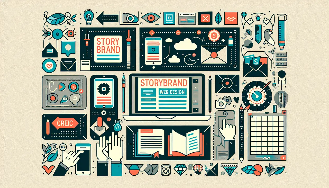
Implementing the StoryBrand Framework in Your Digital Marketing Strategy
March 19, 2024
Featured Posts
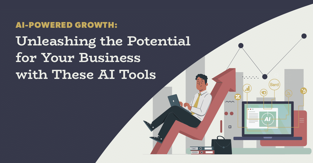
AI-Powered Growth: Unleashing the Potential for Your Business with these AI Tools
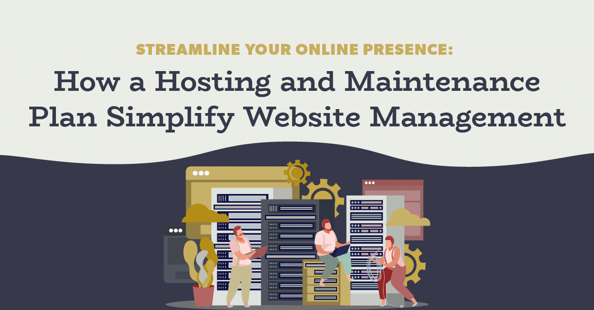
Streamline Your Online Presence: How a Hosting and Maintenance Plan Simplify Website Management
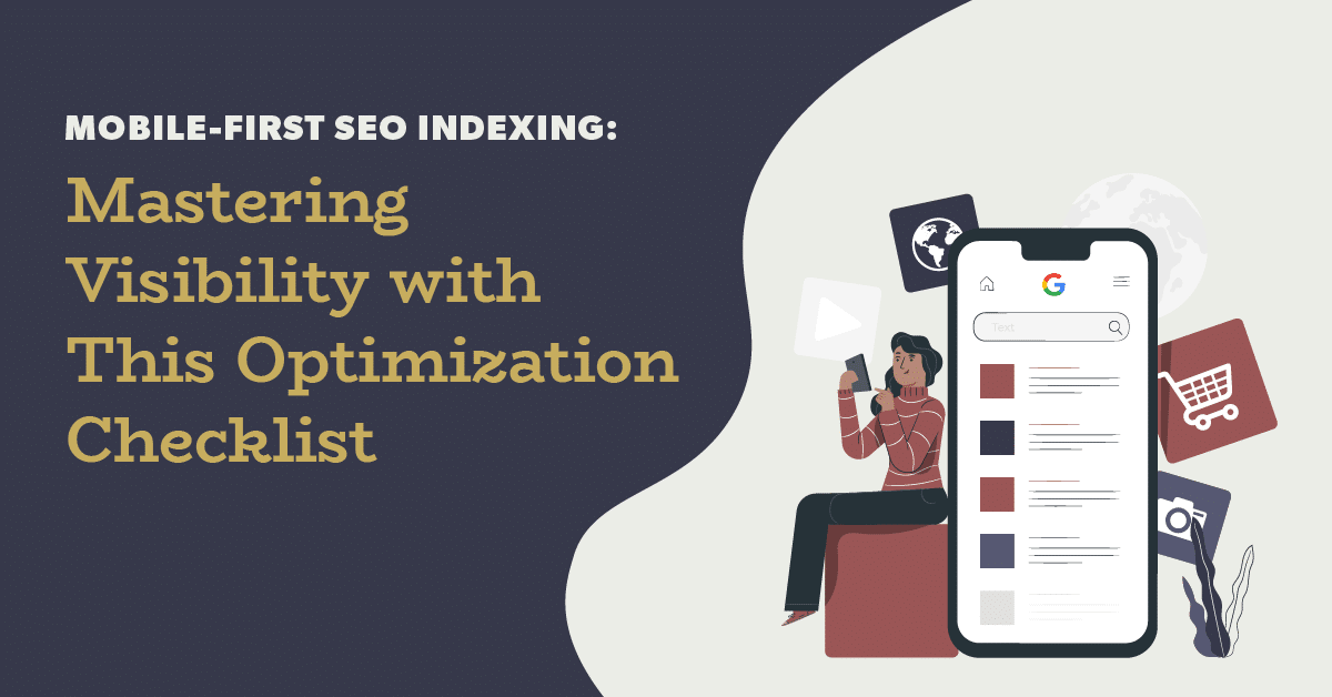
Reach More Customers: A User-Friendly Guide to Mobile Website Optimization
StoryBrand Messaging Framework: Why Your Business Needs a Clear Message
The Benefits of Partnering with a HubSpot Certified Agency
March 15, 2024
StoryBrand Web Design: How to Craft a Website that Tells Your Business Story
March 12, 2024
Subscribe Via Email
Ready to Grow?
Book a Free 15-Min Discovery Call
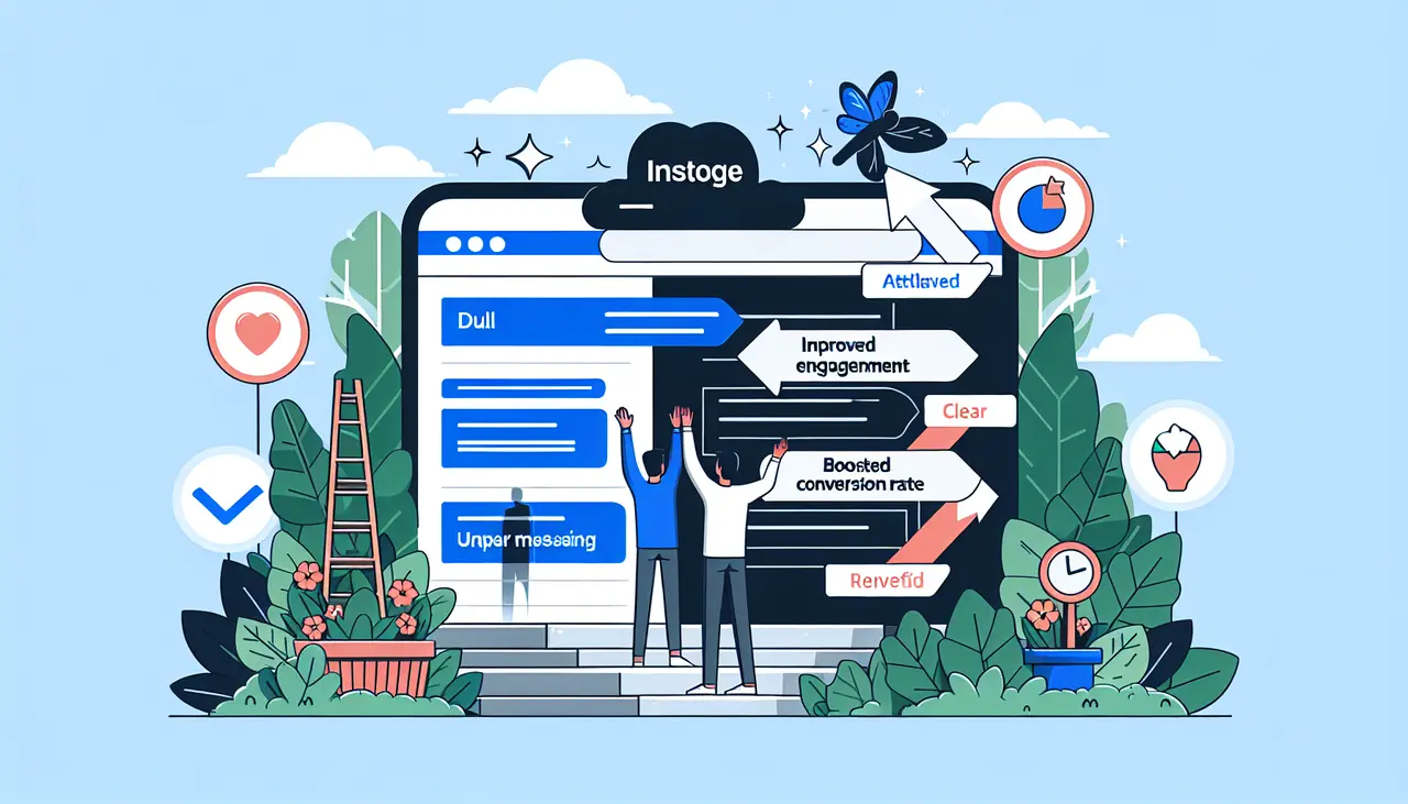
The Benefits of Integrating the StoryBrand Framework into Your Website Design
March 6, 2024
How to use Storybrand to Get More Customers
January 31, 2024
Conversion Tactics Your Business Can Implement with a HubSpot Agency
January 31, 2024
Common Mistakes to Avoid in StoryBrand Marketing
January 24, 2024
Top Marketing Trends for 2024: Insights from a Platinum Hubspot Agency
January 17, 2024
What Does Your Conversion Rate Say About Your Digital Strategy?
December 26, 2023
How to Build a Website that Inspires Your Customers to Convert
December 18, 2023
What Do You Get from Working with a StoryBrand Agency?
December 18, 2023
Page
1
Page
2
Page
3
Page
4
Page
5
Close
About
Team
Podcast
Events
Services
Messaging & Strategy
Branding & Identity
Website Design & Development
Video Production
Marketing Partnerships
App Development
Portfolio
Blog
Contact
Book a Call